Tuesday, October 16, 2007

The Astonishing X-Men


Frak let me borrow some of his Astonishing X-Men issues a while back, and after reading them I immediately added the first hardback collection to my Amazon wishlist. I just got it last week, and I love it. Joss Whedon writes, and John Cassaday handles the art. It's perfect!

I didn't realize until I read the first arc that this is where the storyline for X-Men 3 came from. The whole "mutant cure," Beast's struggle, and Kitty Pryde's importance to the story are all present in the comic.

I have apparently been out-of-the-loop from the X-Men storyline for quite a while now, because I had no idea Jean Grey was dead, that Emma Frost could turn into diamond, or that Colossus had died defeating the Legacy Virus. Or that Xavier had taken off.

Whedon's humor is very present in these books. Once in a while one of the funny comments seems out of place, but I think that's because I was just used to the heavy-handed dialogue from the years I subscribed to X-Men (back in the mid-90s). I think it was Fabian Nicieza back then. With Andy Kubert (meh) handling the art.

I like Whedon's treatment of the characters. There's this great sequence where the X-Men are fighting a giant monster coming out of the ground in Manhattan (the FF show up later and The Thing is all mad that the X-Men are stealing their shtick), and several pages in succession highlight one of the X-Men and their thoughts as they fight. First, Colossus, who is thinking about returning from the dead and his feelings for Kitty, but then chastises himself for not focusing on the fight. Then, Kitty, who is thinking about Peter (Colossus) returning from the dead, her feelings for him, her return to the X-Men, and then also says she should be focused on the fight. Then, it goes to Wolverine. His mind is silent until the final panel, which just says "I like beer." Cracked me up. I'm used to Logan being this deeper, more cerebral character (very talky when Larry Hama was scripting back in the day), and Whedon writes well enough to make him an individual. EVERY character was talky and introspective in older comics; Wolverine just added "darlin'" and "bub" every now and then to separate him from everyone else. Whedon allows for there to be more going on in Logan's head than we know, but, appropriately, we're not always privy to that, nor does Logan talk about it all the time. Logan's a very different character here compared with the movies, and while I wouldn't change anything about Hugh Jackman's take on him, I think Whedon does some great stuff with him in the book.

Cassaday's art is just as awesome as the writing. Look at that hilarious cover up there! I love his redesigns for several of the costumes, Wolverine's in particular. Wolverine actually looks 5 feet tall now, and his "ears" have been appropriately scaled back to make him look more compact, more Wolverine-ish.

Nobody, have you read this series?

Monday, October 15, 2007

New computer, plus Orange Box

I bought a new computer last week. Sort of. I bought a barebones kit, a CPU, and 2 jiggs of RAM, then cannibalized my old (and dead) system to complete it. So now I'm running a 2.4GHz AMD Duo-Core, instead of my 3.2GHz Pentium 4. This new system is much more stable, so far. It runs Half-Life 2 like a champ, which is almost exclusively the reason I upgraded. It's also so I can work on art stuff without worrying about a crash (no comments from the Mengs, please).

I have now played through all of Half-Life 2: Episode 2, most of Portal, and a little bit of Team Fortress 2. They're all pretty rad. I enjoyed Episode 2 quite a bit. Unlike Episode 1, this one really offers a lot of new stuff: new environments, new enemies, new vehicle, new characters, and great continuation of the story-line. And some really epic battles, especially against the Striders at the end. Holy cow.

Portal is tripping me out. If you've seen any of the videos, you know what I mean. For those that don't, here's the gist: you have a portal creating device that lets you place two, well, doorways, basically, on almost any flat surface. The doorways (portals) connect. So, if I'm in a room, and the exit is on top of a tall platform that I cannot reach by foot, I simply create a portal on the ceiling above the tall platform, and then create another portal on the wall next to me. I walk through the portal and am now on top of the platform. The trippy thing is that you can see through the portals. They're not just a weird swirl of sparkles. If you place two portals on opposite sides of a room, you get the infinite-mirror effect. You can also see your own back. If you create a portal on the ceiling directly above a portal on the floor, you can drop through the one on the floor and fall infinitely.

The team that created Portal then applied these ideas to some really inventive puzzles. For example, say there's (again) a really high platform you need to get to, on the opposite side of a chasm, and you can't place a portal anywhere near the platform you need to get to. Well, you could place a portal on the ground at the bottom of the chasm, then place a portal on the wall behind you (that faces the platform across the way). Then, you jump off the cliff and through the portal on the ground, and your momentum flings you through the portal on the wall and waaaaay over to the platform. And that's a basic puzzle.

Team Fortress 2 is really fun so far, but I've only played for about 1/2 an hour. The look is wonderful, though. Highly stylized, and many people have accurately described it as Pixar-ish. Look up the class videos for some funny stuff.

Recent movies - The Thin Man, Double Indemnity, Galipoli, Lake Placid

The Thin Man (1934) - Loved it! I'm probably just going to be repeating the same reasons everyone else gives for loving this series, but I'm new, so bear with me. The couple, Nick and Nora, have such delightful chemistry, and their quirks and mannerisms come off as genuine rather than forced, which really helps the charm of the movie. The murder-mystery part of the story does indeed play second-fiddle to watching these characters do their thing. Nick is like a jovial/drunk Sam Spade. He's still a bad mo' (disarming thugs and dodging bullets), but he never let's it get him down. Nora is really cute. Making faces at her husband, pushing him into danger for her own amusement, insulting his friends. Excellent. It was also funny seeing this in-love couple sleeping in separate beds.

Amy and I will be checking out the rest of the series, no doubt.

Double Indemnity (1944) - Somehow I've managed to avoid seeing any movie with either Barbara Stanwyck, Fred MacMurray, or Edward G. Robinson up to this point. I like Edward G. Robinson a lot, based on his performance here. Barbara Stanwyck, too, was perfect. Fred MacMurray I'm less jazzed about. Hearing him talk got a bit old after a while. He chose a speaking rhythm and never deviated from it, to the point where I could turn on the sub-titles and mimic his delivery perfectly without hearing him do it first. A bit too much of the "fast talk."

The movie is not happy, but very well put together. They (the murderous couple) really sell you on their plot, so you think, "It's fool proof! They'll get away scot-free!", and then Robinson sells you just the opposite direction, and you realize how much Stanwyck and MacMurray overlooked.

Galipoli (1981) - I added this to my queue ages ago, so when it finally arrived, I couldn't remember why I added it. Then, as it started, I realized it was directed by Peter Weir. I think that was part of it, though the unique WWI-from-the-Australian-perspective probably had something to do with it, too.

**minor spoilers ahead**

Gosh, sad movie. It begins very upbeat and adventurous, celebrating life and friendship, and then ends so tragically. Weir describes it as an anti-war film in the making-of, but, along with Paths of Glory, it seems less anti-war and more anti-trench-war and anti-a-hole-military-commanders. Seriously, how many times did awful pointless "everyone over the the wall to your death for absolutely nothing gained!" moments happen in WWI? In both movies, the hero characters are not against war, but they are against military hubris and pointlessly sending men to their deaths. Weir doesn't address the reasons behind the war much. He seems mostly interested in the fact that it was Australia's first time fighting, and that many of the best and brightest young men never returned.

Lake Placid (1999) - Fun movie! Bear vs. crocodile = awesome. What ever happened to Oliver Platt? He's pretty funny here. And Bill Pullman? Brendan Gleason tries desperately to cover up his accent, but it's hard not to hear it.

Thursday, October 11, 2007

Resident Evil 4: Wii

Even though I watched Iang play this game on the Gamecube, and Joel took me through some cool parts when he first had it, I had never played it on my own until now. I rented the Wii edition, and I gotta tell ya, it's a great game.

The precise aiming that the Wii offers is an awesome addition (I had played a little bit of the Cube edition, and aiming with an analog stick is only so precise), allowing me to cap mo' suckaz in the face or the leg with perfect ease. I appreciate that the weapon selection offers some antiques (which makes sense if there really was a mysterious arms dealer out in the middle of some European wilderness), and am currently enjoying my high-powered Mauser pistol. I think some sort of old revolver pops up at some point, so there's that, and once you beat the game you get the option to buy a 1928 Thompson (the "Typewriter"). Yes, that is right up my alley, and thank you for noticing.

The only part I don't like so far is dying by chainsaw to the neck. I just reached a point where I have to fight these creepy old country ladies with chainsaws, and there are like five surrounding me, and they keep cutting my head off. With them, there's no one-hit-and-you're-down-some-life-bars, it's instant death. Your head falls off, and even the amazing First Aid Spray doesn't fix it. Watching my character get his head cut off (rather than just falling over and going "Auuuuuuuuuuuuugh") is very disturbing. I need to collect some shotgun ammo and go to town on these ladies so they never cut my head off again. (Now there's a quote for the yearbook!)

If you have a Wii, you wiilly need to check it out. Thanks, folks, I'm here all week!

Monday, October 08, 2007

Guys who do it well: Westerns

Here is my list of Guys Who Succeed at accurately drawing the Western genre*:

- Dominic Vivona - of Gunplay
- Glen Fabry - of the Preacher covers
- Steve Purcell - see his awesome Sam & Max Western print in my house
- Mike Mignola - from all of one picture
- Marcelo Frusin - of Loveless (from what I've seen - haven't read the trades)
- Phil Noto - shamefully moved to "suxxors" on account of having really looked at his Jonah Hex work
- Luke Ross - from the first of the recent Jonah Hex trades
- Steve Dillon - from what I've seen of his Saint of Killers renderings
**edit** OF COURSE! Jae Lee - of The Dark Tower series. Beautiful! Can't believe I forgot him on the first time through. Absolutely accurate, even if it is set in a weird Stephen King setting.

People who get some right, some wrong:

- Doug TenNapel - excellent settings and costumes, but the guns in Iron West are double-action revolvers, and one of the shotguns he draws is a rush-job.
- Eric Powell - again, good costumes and settings, but the guns that the reverse-zombie guy uses are not cowboy guns, they're double-action revolvers.
- Jeff Amano - of The Ballad of Sleeping Beauty. Remember my post on his errors?

People who get some bits embarrassingly wrong:

-Phil Noto - I've posted some examples of his gun-butchery.
-Clayton Crain - The Ghost Rider: Trail of Tears guy. Bad guns.

People who get it all wrong:

I haven't found any of these guys yet. Mark Texeira's work on the Doomtown card set though was pretty bad, though, gun-wise. His guns looked like laser rifles. Apparently, not only did he fail to do any research, he also has never even seen a Western movie.


*For me, that mostly pertains to accurate renderings of the weapons. Clothing I know less about, but I do think that clothing is easier to fake. They had cloth, they had buttons, you can kind of do what you want and it's probably feasible.

Thursday, October 04, 2007

Interview with Dominic about Gunplay

While perusing the comic blogs Nobody told me about, I found an interview with our friend Dominic Vivona and the writer of their comic, Jorge Vega.

Lookin' good, guys! You have my Official Stamp of Approval.

Wednesday, October 03, 2007

Stealz my shirtz

Short recap: a friend of mine discovered a shirt at Urban Outfitters in Virginia that was a clear rip-off of a drawing from my website. (Click here for pictures.)

In an unrelated (or is it?) incident, our garage was broken into a few weeks ago. It didn't look like anything was stolen at first. We don't really keep anything valuable in there (some camping supplies, an old suitcase, Amy's crash-pad), so we didn't bother filing a police report at the time. But, when I got an email from a woman who wants to buy one of my shirts, I discovered that my box of shirts was gone! I hadn't noticed it until I went to look for them, and then I knew exactly where they had been in our garage. Who steals shirts? How on earth is that profitable? If I see someone around town with one of my shirts, and I don't know them, I'll know where they got it.

So now I've had a design stolen and put on a shirt, and shirts with my own designs stolen.

Stop teh stealz plz!

Tuesday, October 02, 2007

Further snobby whining

There is a new Western series coming out, written by Garth Ennis (side note: last time I went to a comic shop, his name was on about a three million books. Is there anything he hasn't written?). The art is by some new guy (new to me, anyway) named Mike Wolfer.

As usual, I was initially excited, and once I found the preview, disappointed. Here's an interview with the artist that contains several preview pages.

There are several things that don't impress me about the art. First off, the guy uses several artistic cheats that I used to use back in high school (when I still attempted to draw super-heroes). He uses side-view profiles (that's not redundant phrasing, is it?) a lot. Enough that it drew my attention to it immediately. I used to do the same thing: either draw the face straight on, or perfectly to the side. Not very dynamic, and it was because I wasn't very good at drawing any other angles of the face. Now, Wolfer does draw some of the faces from a 3/4 perspective, and a few others at more dynamic angles, so apparently he can, but he chooses the flat side perspective way too much and it looks bush-league. Look at the bottom three panels of page nine in that preview: dead-on front shot that looks like your friend in high school drew it, then profile shot of the old guy, then flipped profile shot. Boooooooooooooooring. And boring anatomy and detail in the face.

Also, the main character telling the story looks like a mongoloid in his first few panels. Giant nose, giant chin, and whaddya know, a lot of the other characters have the same features. He's like reverse Rob Liefeld (Liefeld draws his characters with tiny noses, mouths, etc., in case you're not familiar with his tendencies).

In the interview, Wolfer comments on Ennis' art direction:

"
To his credit, Garth Ennis is very precise in his character descriptions and does an enormous amount of research to insure that his script properly conveys time and place. If you're going to write it, write it right and no matter the artist, Garth isn't going to take any chances that the proper pistol will be drawn, for instance. He'll tell you year, make and model, exactly. It's that kind of attention to detail, that love of his craft, that makes Garth one of the most respected writers in our industry today."

This flies in the face of the horrible made-up weapons I saw in the Ghost Rider series I mentioned (that Ennis penned, if you recall), but Wolfer seems to mean what he says for his own series. The pistols look OK, mostly. Sometimes, though, Wolfer's weaknesses show up in the guns, too. Look here:


Rifle looks good. Pistol falling out of the guy's hand looks good. But check out the monkey-fist holding the gun to the far left of the image. First off, that arm and hand don't look right. Cheater anatomy. I realize it's hard to draw hands at weird angle holding guns, but that doesn't make it right to cheat and draw it in that perspective, because it doesn't look natural. Beyond that, the gun looks weird in several ways. Is it an early double action revolver? The frame near the hammer seems to suggest this. How long is that grip, though? And is it a Bisley frame and grip? I've never seen a double-action with a Bisley grip that had a ring on the butt, but maybe. Even if it was, though, the grip still does not extend far enough away from the frame. It looks like it drops straight down underneath the hammer. It's an awkward drawing that Wolfer didn't bother to correct with proper reference. He claims to have "spent a fortune at Borders and Amazon on Western photo books," so it's a little puzzling why he didn't consult them to see what a hand holding a Colt SAA looks.

Then there's this page:

At first glance, the figure appears to be a giant walking over the land Paul Bunyan style. You really have to study the grass along his feet to figure out that he's supposed to be on the edge of a hill that drops away steeply to reveal a tiny landscape in the distance. It doesn't read well. Then you have the character's foot, which again looks like a cheater drawing (side perspective). From the way the rest of the character is posed, I would have had his foot pointing more towards the bottom corner of the page. Finally, there's the rifle, which was drawn with good reference for the most part. Notice how he's cycling the action of the gun, though? There should be a metal piece extending from the breach of the gun cocking the hammer. Wolfer apparently did not have a reference shot of someone cocking their lever-action, even though he draws the rest of the gun pretty well.

In conclusion, though I appreciate the proliferation of Western comics that is currently going on, I'd really like to see some great artists take on the genre rather than the noobs I keep writing about.

Monday, October 01, 2007

I complain some more about Western comics

I have a new complaint! Yayyyyy!

I have been looking forward to picking up the HC edition of the recent Ghost Rider series, Trail of Tears. The Spirit of Vengeance in the Old West? That's a cool image. I picked up one of the issues during the run, and the art looked pretty good.

That is, until I saw this image:

I don't mind when artists kind of fake a "look" for their props. It's one thing to draw a "sort-of" Winchester that doesn't reference a specific model. It's another to not look at one single picture of a Winchester and instead draw something based on your vaguest childhood recollection of a cowboy rifle. Unfortunately, that is what we see above. Why does his rifle seem to have a pistol grip? Or, if I am being generous, and he is supposed to be moving the lever in mid-cycle, where is the lever?

It's a shame, because his dark hooded Ghost Rider is pretty cool, and from the parts of the book that I've seen, he handles the rest of the stuff well. Alas, for a gun snob like me, I will have none of it.

You can see a couple preview pages here. Check out this pistol:

It looks like a cross between an old single-shot flint-lock pistol (Revolutionary War-era) and a Volcanic Repeater. I don't think that was his intention, though, so Clayton Crain gets an F.

Wednesday, September 26, 2007

New monkey sketches

Sketched these tonight (while attending a very interesting lecture by John Granger on Harry Potter -- Frankie came too, and we both bought one of his books).


He's got a lot of Hellboy in his design (shorts, pouches, grenades, revolvers -- the goggles even mimic the horns when they're up). It was a lot of fun to draw. I want to draw adventure stories with him now.

Preacher Vol. 4: Ancient History

I was made aware that there is a character in the Preacher series called The Saint of Killers. He gets sent to Hell and is offered the role of the Angel of Death, God's own destructive instrument. He accepts, and has the previous angel's sword made into two divine Colts. The first thing he does is cap the Devil. Sounds awesome, right?

You can read his full back-story here. It's pretty messed up stuff. The universe he lives in is depressing. It's a perverted take on our relationship with God and suffering.

I recently discovered that the entire illustrated back-story of the Saint of Killers is contained in Preacher Vol. 4, so I added the book to my Amazon wish list. The covers were awesome, and I remembered liking what I'd seen of Steve Dillon's artwork in the regular Preacher series (and later on The Punisher). Should have been a sure-thing, but I had the chance to check it out at a Borders before buying it, and unfortunately it's not very good. The artwork is not by Dillon, is just kind of ugly, and (you know me) if they can't be bothered to research and draw a proper pistol, forget it. (You can download a .pdf of the first four pages at this link.)

Well, at least the covers are cool. Here they are, for your viewing pleasure.


I apologize for the poor quality of two of the .jpgs. I got them from Fabry's website, and for some reason he has them all displayed low-quality.

He scales the pistols a bit larger than he should in that last piece, but they're still accurate in every other way. And, honestly, if you were going to exaggerate something for a painting and subject like this, that's the way to go. So maybe it was intentional.

Monday, September 24, 2007

Mignola + Western = More, Please

I found this beautiful piece inside a preview for one of the Hellboy prose novels. I have no desire to "read" a Hellboy story, so I make it a point to avoid them, but Mignola still contributes chapter art, and the first story begins with a western tale. It's almost enough to make me buy the book. Almost.

**edit** Bonus awesome Mignola image! Cover from the current Lobster Johnson mini-series.

Biola Alumni Show: 2007 - 2008

The wif and I were both recently tapped for pieces for the ongoing Biola Alumni art show. We had originally missed the deadline back in March for submitting work because we were neck-deep in wedding plans and Biola play stuff, but Barry recently approached us for stuff because they had a few artists drop out at the last minute. So, Amy has some photos in the current show (stuff from her senior show), and I'm going to have some work (hopefully) in the Winter/Spring show. Mine will probably be some pages from the Pooks comic.

There is some cool stuff in the current show (Zack Kleyn's stuff is always very intriguing -- he gave a lecture recently about his studies of the theme of voyeurism in light of the current popular technology trends (blogging, YouTube, Myspace, etc.), so if you're in the area, check it out. It's cool seeing friends and Biola alum who are still serious about making art.

Oh yeah, they're going to be printing a nice book full of alumni art as well, which I hope I will be in.

Final note: any Biola art alumni who aren't submitting stuff for this are gay. Scientifically.

Saturday, September 15, 2007

Guy Davis draws awesome stuff

Check out this uber-sweet monster Guy Davis drew for Sam Hiti's fight blog! I like this guy's stuff more and more.

Check out this BPRD cast shot, too.

The Learning Curve - Pook Mine

The worst thing about working on this comic is that it takes me forever to draw everything but the monkeys. I can draw you a monkey in 10 seconds, but ask me to draw a mine, a town, the interior of a bar, anything else, and it's gonna take me a long time. I'll go through all my graphic novels that might give me a hint (Bone, Iron West, and Usagi Yojimbo for this book), and try and Google Image Search some reference.

The other thing that is slowing me down is shading. I can draw you fake one-light-source shadows all day, but drawing actual shadows (or, at least, good enough fake shadows) scares me. My characters are very cartoony, but my tendency is to draw everything else a bit more realistic. It makes the characters pop off the backgrounds better. Bone is like this: the Bone cousins are very simple cartoony characters set against these amazingly rendered backgrounds, and it works so beautifully.

A page I had inked back in July was giving me some anxiety because of the shading. It takes place in a mine with a single light source, a lantern. Most artists can get away without doing exact shadows for any stories that take place during the day under normal lighting, but as I finished the panel, I realized an enclosed space with a definite light source needed appropriate shadows.

Here's the panel as it existed originally (though I had already started darkening in the tunnel here):


This is one of the pages I showed to Stan Sakai at the Comic Con, actually. He advised me to make the long black shadows there are appropriate for the lighting of such a scene. That was what made me anxious, because I didn't want to ruin the page. So, I scanned the panel in and started dabbling with it in Photoshop to see how it would look with everything darker.


It didn't look too bad, so I took the plunge and inked them on the page:

I think it turned out all right. I added a lot of texture to the ground and walls as well to continue the darkness. I still have a lot to learn about inking (the lines on the back wall aren't "classy" inking, they just get the job done), but each step makes the next less daunting.

Thursday, September 13, 2007

Hellboy HCs coming!

According to Dark Horse, Spring 08 will finally see the release of the Hellboy trades in HC.

Also in spring of 2008, Dark Hose will begin releasing Mike Mignola’s Hellboy in hardcover, “Library Editions” similar to the treatment it has given Frank Miller’s Sin City. Each hardcover will collect two trades which will be collected in chronological order. All of the current trades are slated to be collected in this format.

I'm a huge fan of getting HCs of the work I really like, so this is a no-brainer for me. If they are priced like the Sin City Library Editions, Amazon should have them for a good discount.

Wednesday, September 12, 2007

3:10 To Yuma (2007)


Finally saw the new 3:10 To Yuma last night.

Overall: good not great. I did see the original first (which I loved, if you recall).

The Good: setting, action, character designs, music.

The use of a snowy background in the final scenes was a beautiful choice. It was almost an alien landscape. The bright white pops up in the background of this dusty brown town so suddenly that it jarred me. The rest of the locations were appropriately beautiful as well, though sometimes the shots of the group could have been a bit wider to better show their location.

The action was pretty good. Good gunfights, though the sound effects could have been a bit better. For the most part, they were better than the canned sound effects of, say, Young Guns or something, but they weren't at the level of Open Range. Mangold went for realistic with his sounds, so he should have aimed for Open Range's heights. He did add a bit of character to the different character's gun sounds, though, and that was cool. The shootouts were pretty well staged, and I desperately want Tanaka or Marushin to make a Schofield now.

Mangold did a good job making each character look distinct. It wasn't just "Western guy 1 with brown hat" and "Western guy 2 with lighter brown hat and dark pants." You had Ben Wade, dressed as a gentleman gunfighter, with bowler and nice-but-dusty suit and sweet-but-irrelevant-to-the-story "Hand of God" Colt S.A.A.; Dan, skinny and scraggly with one leg and plain, droopy, drab clothes, armed with a Sharps rifle (which, even though it is said that he is a crack-shot, is never put to good use); Charlie Prince, bearded and clad in a distinct cream leather jacket, armed with dual Schofields; Byron, aged bounty hunter wielding a sweet looking shortened shotgun (which is a carry-over from the original movie -- the gun, not the character, oddly).

The music was well-done and clearly inspired by Morricone's style. I appreciated that Mangold chose to use this sort of music rather than some sweeping orchestral score.


The Meh: padding the story with extra scenes and characters, shortening the best parts from the 1957 movie.

There were several scenes and characters in the new one not present in the first adaptation. Some were OK (like the scene with the Apache attack) just because they had some cool action, but none of them added much to the story. Adding Dan's kid to the mix didn't do a whole lot for me either. In the original, it was sufficient to show his family's disappointment at his ranch and then leave him to wrestle with that on his own for the rest of the movie. Keeping the kid around the entire time artificially created a tension that wasn't as interesting or dramatic, because it took focus away from Dan and also diluted Dan's decision-making process. (If the kid is right there, there's much more pressure to "do the right thing," and it makes his decision less about him having the courage to do what is right and more about "well, can't look bad in front of the kid.")

This also hurts my favorite aspect of the original movie, the moral conflict between Wade and Dan. It's just not as well-executed in this new one. I really felt for Dan in the original, and you could just see this moral anguish going on in his head the whole time as Wade tortures him in the hotel room. It was some profound stuff, and it comes off as forced and awkward in Mangold's version. Also, it's not as efficient in its storytelling. The 1957 version seemed to center entirely around the waiting in the hotel room, which was the most interesting and provocative part of the story, while the 2007 version treated that scene like any other and just moved through it.

Another (rather odd) negative aspect is Bale's physicality versus Van Heflin's. For whatever reason, Mangold made Bale scrawny, greasy, and weak-looking. You never once thought he could take Crowe in a fight. In the original, Van Heflin is physically bigger than Ford, and this makes his character that much more tragic. It's a minor detail, but it made me sympathize with him more. Here is a man who you can see once had the respect of others, who had control over his own destiny, and who has now lost the respect of his own family and has to beg for money. The physical difference tipping the other direction worked better for the conflict between Ben and Dan.


New 3:10 - fun, satisfies my desire for some Western action, but not the great movie that the old 3:10 is.

Wednesday, September 05, 2007

Wet Hot American Summer (2001)

I forgot to write about this one. I saw it originally on Comedy Central one day, and some of the scenes killed me. Paul Rudd's character is freakin' hilarious throughout the whole movie, whether he's begrudgingly picking his tray up off the cafeteria floor or letting a kid drown so he can make out with a loose camp counselor. Or throwing the only witness out of a speeding van miles from the camp.

The movie is a spoof of summer camp movies. It hits all the cliches and takes everything pretty far (including a gay scene that went way further than I wanted it to -- you'll know when it starts, and you can immediately skip it without missing anything), from the "geeky guy
tries to pry hot girl away from jerk," to "desperate guy who is all talk tries to lose virginity before camp ends," to "impending over-the-top doom for the camp," to "the cook is bat-$#!^ insane." And probably hundreds more.

The cast is great: Janeane Garofalo, David Hyde Pierce, Paul Rudd, that guy from that law show I think (who is hilarious, it turns out) named Chris Meloni, Amy Poehler, Molly Shannon, Joe Lo Truglio (from Superbad, most recently), and Elizabeth Banks (40 Year Old Virgin). Plus other funny people.

The movie has some pretty raunchy moments, but it's also got some really really funny stuff. I don't even remember this coming out. Did it bomb horribly? I would think this would be one of those movies with big college followings. It's very quotable.

B.P.R.D.: The Dead

I have actually been avoiding these BPRD books for a while now, because initially I had been turned off by the lack of Mignola art. I also remember looking through one of the books and not caring for Guy Davis' style. I recently flipped through a BPRD book at a Borders, though, and realized that I've been depriving myself of something I'd actually really enjoy.

I like this book quite a bit. Guy Davis' art has really grown on me. In fact, I think it's great stuff. It serves the story very well. His renditions of Mignola's characters and stories achieve just the right feeling, that of horror mixed with humor mixed with pulp. The writing, too, holds that balance at the same level as the art.

The story concerns the BPRD (which stands for Bureau for Paranormal Research and Defense -- it's the team Hellboy used to belong to) moving their headquarters to an abandoned military research facility in Colorado. Once there, they encounter crazy Nazi/ghostly/paranormal weirdness, of course. There are some great moments of humor and horror as the story unfolds. One such moment involves Ben, the new team leader, ordering Roger to put on some pants, then changing his mind when he sees the result of his order. Roger is also mystified throughout by everyone's insistence that he should have a gun. Johann, at one point, find this awesome looking 40's style machine/weapon that he straps to his back to fight an "angel," and the image is one of my favorite illustrations from the book (actually, you can see it on the cover up there).

There is also a secondary story about Abe Sapien's past. It's ok, but it is sort of distracting from the main story. It takes a long time to get where it's going, which is not that climactic once it's there. It feels like it should have been a standalone section in one of Mignola's Hellboy books rather than a back-up in a BPRD book.

I love the new characters Johann and Ben. (Johann is the character on the top center of the cover above; Ben is on the far right on the bottom, though you can't see much of him.) Johann adds more good weirdness and Ben's personality hits off the other characters in interesting ways. I'm looking forward to finding more out about each of them.

Another reviewer mentioned that Roger's personality seems a bit different from his outings in the pages of Hellboy. I agree with that, but I don't think the change is a bad one. It actually adds another layer to the team dynamic, and it's not so far off from Roger's previous depictions so as to be jarring.

I will definitely be picking up more of these books, provided that this creative team is still involved. I'm partial to consistent creative teams, and since from book 3 on the team all Davis, Arcudi, and Mignola, it looks like those will be the ones I collect.

Monday, September 03, 2007

Cowboy Monkeys from Comic Con 2007

Here you go! These are all the cowboy monkey sketches I collected at Comic Con this year, in the order in which I received them.
First is Gabe's (from Penny Arcade). A fine rendition! A good way to start the series.

Next is one of my favorites, illustrated with shaming speed by Sir Eef.


Next is by J. Goldberg, the artist from this book. I think it's a great monkey.

Then comes Val's irrepressably cute anime version:

Frank Cho provided his own alter-ego for this one:

I caught Rob Schrab and got this piece! A bargain at $20.

Then I had my good friend Frak take a crack at it. My only solace is that I can draw better guns than he can.My friend Mike whipped up this little ditty over lunch. As usual, he takes the opportunity to make a respectful tribute to our nation's history.

Then our friend and Comic Con buddy two-years-running Steve followed it up with an insightful take on a modern political issue. (He kept insisting that he sucked at drawing -- good one, Steve!):

Next I handed my sketchbook to Doug:Then, just across the floor from Doug, I asked Steve Purcell if he would oblige. He looked hesitant, and said, "It'll just be a quick one," and then ended up with this:

Then forum friend Sean gave me this! I couldn't believe how many people could draw good cowboy hats. I suck at them.

Comic errors

And I'm not talking about Rob Liefeld's refusal to learn human anatomy. (very tired ZING!)
I recently picked up The Ballad of Sleeping Beauty, because, of course, it's a Western comic. It's decent. The art is pretty good, and the weird Carnivale-like stuff in the story is interesting enough. The artist draws a good gun-fight, something a lot of my other Western comics are lacking, even if he does opt for a modern muzzle-flash rather than a technologically appropriate puff of smoke.

One of the things that bugged me about it (cue loss of normal audience here) was that the artist kept drawing the guy reloading his Civil War-era pistol with a swing-out cylinder. I don't know exactly when swing-out cylinders became the norm for revolvers (my guess would be at the turn of the century when double-action revolvers were becoming the standard), but I do know that no cap-and-ball or cartridge conversion pistols from that era had swing-out cylinders.

What's worse (WORSE!) is that the arist has the auDACITY to draw the same error a few pages later, but swinging out on the OTHER SIDE! Can you believe it? No revolver has ever worked this way. Come ON.


I like how he never draws the cylinder arm. Where is it? How is the cylinder sliding out? It's in the shadows. We'll never know.

I admit that that is a pretty nit-picky and nerdy thing to be bothered by. How many people know that kind of thing, after all? I mean besides anyone who has ever studied the operation of those guns.

But BUT I have something that should make you all laugh now. I enjoyed Damion Scott's art for the Batgirl book quite a bit. Once in a while he had some issues with storytelling, but for the most part it was my favorite depiction of the awesome Thai Batgirl. There is one panel that cracked me up, though. Let's see if you can spot the problem.


See it yet? Yes? Awesome. No? See the closeup below.


*pushes up glasses* Ahhh, excuse me, are we to believe that this is some sort of magic auto-shell-ejecting revolver? Ah ha, ah ha, ah ha. Boy, I really hope someone got fired for that one.

Saturday, September 01, 2007

Western Nerd

I finally got a picture of all my Western-themed airsoft guns. I swear, they're for reference.

I know I've lost my audience at this point, but, for myself, here's a list of them from top to bottom:

Winchester 1887 lever-action shotgun (the one from T2, but full-size -- Nick Cage also used one in Ghost Rider), Winchester 1892 rifle, Winchester 1873 Randall Custom (based on the gun Steve McQueen used in his TV show), Remington 1851, and two Colt S.A.A.s.

Friday, August 31, 2007

Nerd

Nobody had an accurate and horrifying realization in the comments section of a recent post (in reference to Amy embracing my nerdiness):

Face it, you hit the jackpot!

But on the other hand it sounds like your marriage is completely malfunctioning because it was supposed to make you less like a single comic book nerd, not more like one!

Just don't ask her to dress up for conventions.

He's totally right. But don't worry. On the nerd hierarchy, I think I rate above the "dress up like an anime character" nerd, and I would never encourage or even tolerate Amy lowering herself to that level. Funny nerd t-shirts are acceptable, though. Josh, your wife wearing the knit Leia hat is totally cool because it was funny.

I'm not helping myself, though: I recently acquired a set of samurai swords. That is another step down the ladder (even if they were a gift).

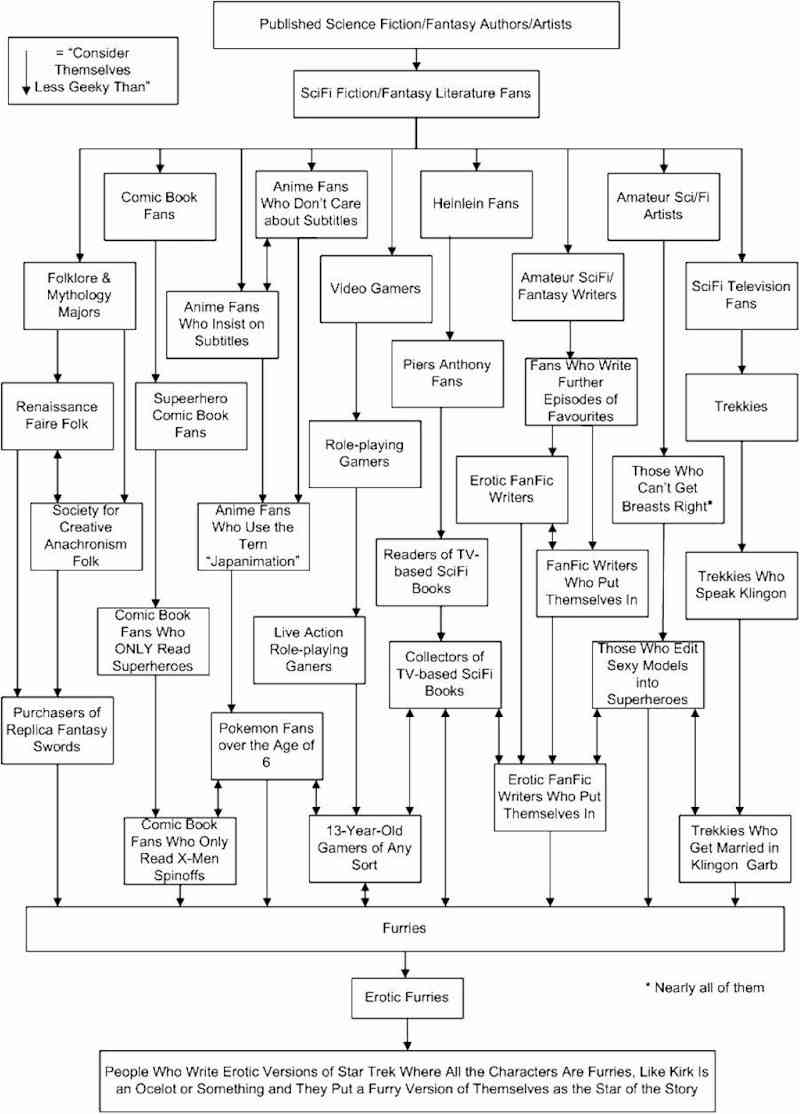
Someone should write up a nerd hierarchy. I'll bet someone already has.

**Update**

Brendoman has come through by finding exactly such a hierarchy!

Thursday, August 30, 2007

Dudley the Fuzz-Butt: 1994 - 2007

Our family's beloved Pembroke Welsh Corgi, Dudley, was put to sleep yesterday morning. He had only started showing signs getting old within this last year, but it overtook him very quickly. The vet thinks he developed cancer. My mom had a store of painkillers to last Dudley through the week, so that anyone who wanted to say goodbye could come home on the weekend before he was put to sleep. Unfortunately, he woke up yesterday morning and could no longer use his hind legs. My mom made the difficult decision to take him in sooner. I was able to leave work and drive home yesterday to be with her when she took him in. My dad is out of town until the weekend and my brothers are up here at school now, so she would have had to do it all on her own, and considering that Dudley was her dog, it would have been really hard to do it alone. Well, it was hard even with me there blubbering like a baby, but at least we had each other's shoulders to cry on.

He was a great dog. He cheered us up when we were low, he played with us any time we asked, and he peed on one of our wedding presents. He was about the cutest dog in the world, but he also had a very regal side that belied his naturally goofy looks. He barked like a big dog, had overhead clearance like a little dog, and loved to lick empty ice cream bowls. We shaved him in the summer, giving the appearance that he was wearing white pajamas, and he would honestly sulk for a day or so as though he knew how ridiculous he looked.

We loved him very much. He will be missed and spoken of often.

(I'll try and get some pictures to show you. You can google "Pembroke Welsh Corgi" for an idea. Dudley looked like the most handsome ones you'll find.)

Tuesday, August 28, 2007

Not-so-recent Westerns - 3:10 to Yuma, Rio Bravo, Young Guns

(I actually started writing this before I got married, but only recently finally finished and posted it.)


It's nice to know there are still some real gems out there to discover within the Western genre. I rented 3:10 to Yuma and Rio Bravo recently, and they have immediately become two of my favorites (especially 3:10).

3:10 to Yuma (1957) - 3:10 handles the hero and villain very differently from most movies, especially from that era. The bad guy isn't your typical villain. He has a sense of morality, but he's not a tragic villain, as would usually be the case. Very interesting character. The hero, too, acts from very human (fallen) motivations, and his ultimate choices make him that much more triumphant morally. The pacing and location shots also make this film stand out.

Rio Bravo (1959) - Rio Bravo is a pretty fun film as well. Dean Martin's character arc is great, and Stumpy is surely the model for the original "Old Prospector." Angie Dickinson plays one of the most sensual characters I've ever seen. She exudes allure.

Young Guns (1988) - Young Guns sucked six ways from Sunday. There was nothing redeeming. I will now avoid Young Guns II with all the cat-like agility I can muster.


To summarize: you all must put 3:10 to Yuma at the top of your rental queue. It's awesome. See it before the new one colors your view.

Recent movies - Paths of Glory, Nausicaa of the Valley of Wind, Surf's Up

Paths of Glory (1957) - I didn't even know this was a Kubrick movie until I saw his name in the opening credits. I actually rented it just because John Kricfalusi recommended it as a study for animators in "specific acting."

Anyhow, the film: it is beautifully shot. The way Kubrick stages the scenes and moves the camera and uses his locations is really remarkable. **spoilers** The scouting scene, the assault on the Ant Hill, the courtroom scene, the final march to the firing squad. The fact that Kubrick chose to show the actual execution rather than cut away to a reaction shot really drives home the injustice of pride that cost three men their lives at the hands of their own country. **end spoilers** There is a really interesting point of contrast to be found in the relationship between Dax and the General. Both are manipulated/pressured into sending their men off to certain death, but Dax physically leads his men and assumes the same risk they are taking. You're angry at the General's arrogance in giving this order, but you find yourself supporting Dax because he actually leads his men. The General sees the men as tools, but Dax sees them as human beings of equal value to himself. Also helpful in raising sympathy for Dax is the difference in the way he was pressured into obeying the order. Dax's pride in his men is appealed to, whereas the General gives in based on the promise of further rank.

The overall message of the story doesn't seem to be a broad anti-war statement (which makes it unique), but a condemnation of military hubris and the devaluing of a soldier's life. Pride and the devaluing of life is the cause of each of the problems: the General's pride leads to him ordering a futile attack; the General's pride again prevails in ordering the execution of his own men as "an example"; the pride of the other CO prevents him from acting on Dax's accusations and saving the wrongfully condemned men.

Good movie.

Nausicaä of the Valley of Wind (1984) - Typical Miyazaki movie: lots of fun airborne contraptions, "man is poisoning the earth" message, plucky heroine, some goofball supporting characters, beautifully designed landscapes, and giant mechanized warriors. You can tell this one came out in the 80s because of the funky sound effects and music. I enjoyed it, though I prefer his subsequent efforts (mostly because those bugs freak me out).

Surf's Up (2007) - Pretty fun movie. Easily the best animated waves and surfing ever done. These guys actually studied what waves do and how surfers move (even if there was some ridiculous "360 aerial flip" stuff). Jeff Bridges was perfect. I didn't even recognize Jon Heder, which speaks well of his performance! Wifey-Amy loved that there was a surfer from Michigan. Overall, it could have used more laughs, but the story was pretty good and carried the movie well (which is saying a lot for a surfing movie). Very similar to North Shore story-wise (fish-out-of-water surfer gets big chance in surf contest vs. jerk), but minus most of the campiness.

Dom won!

Dom's entry into the Comic Book Challenge won the grand prize! His book is going to be published sometime in early 2008. Congratulations, dude. You deserve it. Let's hope this leads to more printed work from you! I want to hang out at Comic Con.

Here's their synopsis image, for those that haven't seen it:

Friday, August 24, 2007

Gift for the Wif'

Forgot to mention: I bought my wife this really cool Star Wars statue when I bought my Hellboy dolls.

The trial is over

I've been serving on a jury for the past 5 weeks, and we finally finished everything yesterday. It was a gang-related murder in Compton. There were two juries, one for each defendant. One defendant was the driver, the other was the shooter. We found our guy (the driver) not guilty of Murder, Attempted Murder, and Discharging a Fire-arm into a Motor Vehicle. We think he just gave the wrong guy a ride that day. The other guy is guilty as hell and I hope the other jury comes to that conclusion. They were still deliberating when we finished, so I don't know what their verdict was.

It was a really interesting experience. It was my first time serving on a jury. I learned a lot about the judicial process, gangs, and Compton. The courthouse was in Compton, so I got to know the little area around there pretty well. I had a couple weird experiences outside the courthouse speaking with or over-hearing locals.

We had a pretty good group for our jury. We all became friends by the end. One jury member is even planning on a little jury get-together sometime in the future.

Wednesday, August 22, 2007

Got the alien!

Though the giant robotic monkey has eluded capture, I was successful in catching another rare hunk of plastic: Mike Mignola's alien.


Just a beautiful design. I love the little Kirby-esque facial details.

I also got Johann, Roger, and Hellboy with rocket pack in the set. Johann is another really cool character.

The version I have features a transparent head and transparent yellow ectoplasm instead of the blue.

Johann has yet to be featured in any Mignola-drawn books, unfortunately, but he was created by Mignola. He's a being of pure ecto-plasm who is contained in the suit you see above. He's a different sort of "ghost in the shell."

Vote for Dom!

Dominic Vivona, a fabulous illustrator and friend, is in the Top 3 for a comic book contest. Please vote for his book with Jorge Vega! It's a western with an interesting otherworldly premise (it's actually sort of like Morbius minus the vampirism, if that makes sense -- a curse that forces the character to kill, but he tries to kill only those who deserve it).

Vote here! It's called "Gunplay." Dom's name isn't listed among the choices, you have to select Vega.

More posts coming soon, I promise!

Monday, June 18, 2007

Married

I'm married to the love of my life and it rules and that's all for now except that those bearings I did art for finally came out but they changed the design a bit and I don't care for it as much but it's still pretty cool.

Thursday, May 17, 2007

Kriegaffe! Damn you!

Mignola's work is engaging not only because of its graphic brilliance, but because of its wonderful sense of pulpy humor as well. Mezco Toys has been releasing some really nice action figures based on Mignola's Hellboy books, and I have two so far: Hellboy and Lobster Johnson. They're well sculpted and capture Mignola's art very well.

Wouldn't you know it, the coolest figure from the first wave is also the rarest. Behold Kriegaffe, with floating Nazi Overlord's head:

Monday, May 14, 2007

Recent movies

The Matador (2005) - I enjoyed watching Pierce Brosnan having fun acting. Though I know he regrets the studio's decision, I'm glad he's done with 007. Roles like this are (apparently) much better suited for him. He's a good comedic actor, and this script was just right for him.

There were a couple moments in the movie where I thought it was going to go somewhere darker, but to the film's credit it keeps the tone light throughout (as light as a movie about an aging assassin can be). I think going on a darker route later in the film would have been cheating.

The Hour of the Gun (1967) - I think I'll try to see all the Wyatt Earp interpretations now, because (as far as I know) there are only 1 or 2 left. I've seen Tombstone, Wyatt Earp, Warlock, My Darling Clementine, and now The Hour of the Gun. I think Gunfight at the OK Corral is the last big one.

Hour of the Gun says in white letters at the very beginning, "This is the real story. This is the way it happened." Well, from what I've read on the subject, it's one of the more accurate interpretations, but it still plays with the timeline and embellishes several events. One alteration in particular seems to be The Standard for Wyatt Earp movies: Virgil and Morgan getting shot on the same night. The assassination attempts were actually several months apart, but The Hour of the Gun, Tombstone, and Wyatt Earp all place them on the same night. It makes sense from a storytelling perspective, but it's funny that HotG would make such a bold claim about accuracy and still fudge a few months. I wonder if HotG set the precedent for this alteration?

I like Jason Robards a lot. He doesn't utilize a Southern dandy accent like Dennis Quaid or Val Kilmer, but he plays a great Doc regardless. James Garner plays Wyatt very straight. Robard's Doc serves as a good foil for him in this regard, often speaking to the emotions and true motivations that Garner's Wyatt never allows out.

HotG might be the first Wyatt Earp film to touch on Wyatt's darker side as well. It doesn't treat him like an outright bully, but it does call into question the righteousness of his crusade to avenge his brothers.

Look for a young John Voight as Curly Bill Brocious.


Adios Sabata (1971) - My first foray into non-Leone spaghetti westerns. I don't know why this one got sent first, since it's not the first Sabata movie. This one features Yule Brynner instead of Lee Van Cleef in the title role.

It's not a great film. But it does have some really cool bits of style and creativity that are hallmarks of the genre.

Gimmicky weapons: check. Sabata has a shortened rifle similar to Josh Randall's in Wanted: Dead or Alive, though this one is clip fed for some ridiculous reason. Honestly, it doesn't make a lick of sense. Allow me to nerd-out on the gun for a moment: Sabata has to use his other hand to push the clip through manually, and it doesn't appear to increase his magazine capacity by more than one or two rounds. What's more, it would make the gun even more inaccurate since he wouldn't be able to steady the gun with his fore hand. Of course, we still see Sabata making amazing shots from hundreds of yards away. This makes Blondie shooting Tuco's rope look like stark neo-realism.

Further weapons gimmicks: the Hungarian (right?) Colonel uses a model ship with working cannons to dispatch a dude he doesn't want to pay. One goofy mute guy who likes to flip around like a monkey is also a dead-eye with the ol' "iron ball on the toe of your shoe."

It features a very creative villain death: the Colonel has had a portrait painted of him, and at the end he is facing off against Sabata in the same room as the portrait. The Colonel ducks behind the portrait just as Sabata whips a knife at him, which stabs into the portrait and then is dragged diagonally down it as the Colonel falls behind it. Pretty cool.

There are some other elements (Sabata's costume, the "Dance of Death," and the fat revolutionary dude's speeches whenever someone dies) that are half cheesy/ half funny.

Tuesday, May 08, 2007

Payback: Director's Cut

A lot of the "Director's Cuts" I've seen don't do much to justify their existence. They have a few "cut" scenes dropped in, but most of the time they interrupt the pacing and offer no real change to the film. The term has become synonymous with "Unrated Cut" and comes off as a marketing gimmick to get people to shell out for the same movie again.

I haven't seen the original cut of Payback since probably 2000, but I remember enjoying it. It was a gritty crime film with a good dose of humor and Mel's trademark "I love being tortured" shtick. I rented this director's cut to see how it played, since it was apparently a dramatic difference rather than a few new scenes thrown in here and there.

I'd say the new cut is a much better movie than the old one. It eliminates Mel's narration, which I think greatly improves the way Mel's character is explored. We get to watch it rather than hear it, so he is now Porter rather than Mel Gibson. One of the strengths of this character is that we don't fully understand his motivations (see also Point Blank with Lee Marvin); we have the duration of the film to try and understand his code, his principles, and the original narration spoiled the process.

Another change is the filtering. The movie is no longer entirely washed out blue, it's full of warm tones as well as cool. I like this as well. It still fits the mood of the movie, and it's more visually pleasing.

As for new scenes, I couldn't really tell what was added in. I could tell what was removed, which was the kidnapping sub-plot, Kris Kristofferson's character, and the subsequent torture and escape. The new cut features a tidier finale, and the whole movie is actually shorter than the original cut. It clocks in at around 90 minutes, which works for this story. I remember liking Porter's escape scene in the original (clawing his way through the backseat), but I think the new cut keeps the pace consistently and serves the story better.

It's definitely worth checking out.

Wednesday, May 02, 2007

These always make me smile

Animated avatar: "Invincible Chunk."


omg i lovzzors corgis!.

Hee hee, giant seal.

Only 2 performances left

The last two showings of Fools are this Friday and Saturday at 8pm. If you don't come and you live in the area you were not really my friend ever and I would like to ask that you stop reading this blog for seriously.

I will be shaving my beard come Sunday, and auctioning off bits of it for charity. I'll post eBay links as soon as they're up.