(An odd time to make a new post, but that's what happens when you should be doing other things.)
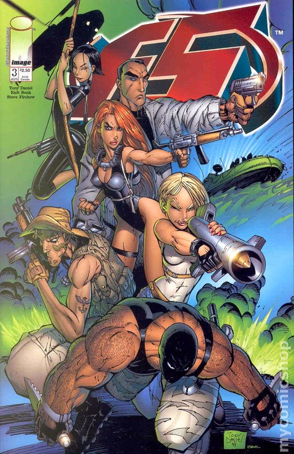
I found this gem in an old Wizard magazine. There are many things that are lame with this cover, but can you see the worst offender? In the article accompanying the comic announcement, creator Tony Daniel says that this book is about a team of ex-Navy Seals posing as meteorologists (even though women are not allowed to join the Navy SEALs). I could leave that premise there and this post would serve its purpose. But the art goes further. Daniel claims to "love weapons of war" and "the military," so I'm sure he's at least seen a movie with an RPG or bazooka, right? Or maybe he's launched a model rocket before? Research is key whenever you write anything, though most comic creators seems to rely on their memories of movies, but Daniel couldn't even be bothered to watch ANY movie within the genre he's writing. I can't believe no one stopped him before this went to print, because even if he has no idea how a rocket works, you'd think the colorist, editor, publisher, or even an office intern might.
Check out the blonde girl with the rocket launcher who is about to burn off her face:
Maybe it's intentionally supposed to look stupid, and inside the book the girl is an idiot who doesn't know what she's doing. Maybe she's comedy relief.
Other art crimes include the thigh position of the gimp at the very bottom. His left thigh is not attached to his body if it's coming back in from that angle. Also, why is he wearing a mask with a black tank-top? Then, look at the leg of the skinny guy on the left of the cover. How thick is that leg??
Lastly, the composition of the cover is just bad. Instead of following good design and giving the eye a good path to travel, this is just a jumble of boring people thrown haphazardly together. Does this entice anyone? Does anyone past sixth grade think this looks cool?