Tuesday, December 19, 2006

Crying Wii-tears

Who do you have to whack to get a Wii around here? Another big shipment comes in this weekend, and another million fan-boys and jerk-butt eBayers snatch 'em all up. Nintendo, you said you'd ship enough by the end of the year so that I could just walk into a store and a leave with one. You lied to me through song!

To make it worse, Joseph Lamb visited yesterday and regailed Nathan and I with wondrous stories of Rayman: Raving Rabbids, a game for which I think I've watched every video available. I love the design of the rabbits so much. It's funny, because I think Rayman himself is a terribly unappealing character (design-wise). See exhibits A and B below.

Cute as the dickens.


R-Tard. How did this guy get a second game? He's horrible. There was never an era where his look was "cool." He has none of the appeal of Mario, Sonic, or Megaman. He's no leading man.

I would, however, buy any game featuring those rabbits.

Monday, December 11, 2006

December 10th, 2006

Yesterday afternoon I asked Amy Lynn Lyzenga to be my wife and she said yes. No small proof that there is a God and that He loves me anyway.

Here are the cartoons I used to help me do it.

Thursday, December 07, 2006

Cover Critic: Bone Graphic Novels

I love this kind of stuff.

While I agree with his assessments of the first novel for the most part, he picked the weaker of the two best covers. I think the 3rd cover is a stronger illustration than the 4th. From a publisher's standpoint the 4th is better (it's more likely to grab a kid's attention), but as someone who knows the story the 3rd is less cartoony and a better representation of the tone of the story.

An example he doesn't show is all the previous covers from The Great Cow Race. Here they are:

This is the first cover. It has nothing to do with the titular race, but it is a pretty good moody piece that accurately represents an important part of the story. See the Scholastic version of Vol. 3 for a piece that botches the mood of these rat creature confrontations in the forest.

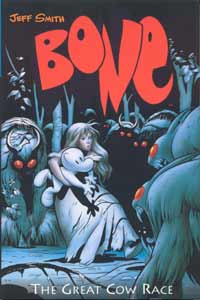
This is the 2nd edition, and it's pretty good. We can clearly see that this is the race, all three bone cousins are visible, and you can even see some rat creatures in the back. The colors are strong as well.
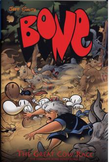
This is the Scholastic cover for the current edition. It's actually one of the better Scholastic covers, and is a pretty good contender for best cover of the three. It doesn't feature the shortcomings of the other Scholastic covers, like Bone being to huge and cartoony, or inaccurately depicting the scene as light-hearted (again, see Vol. 3 below).
****

Volume 3 has an odd assortment of covers.

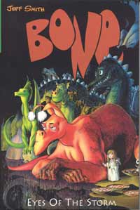
This is the first, aaaaaaaaaaand it sucks. Even in the story it's not clear how these dragons are important until the last issues of the entire series, so this is a poor choice of image. Plus, I never liked how Smith used dragons that looked like they all came from different universes. There is little visual continuity between them. You've got the Great Red Dragon, who is purely Smith, then you've got a cartoony Puff lookin' guy, then Serendipity, then some flying dragon who is closer to Smith's own style but not quite. It's also very static. These are the most boring dragons ever. Bleh.

The 2nd cover, and my favorite. Features one of the best scenes from the book, which also happens to be one of the finest illustrated sequences ever put on paper. Fone, Granma, and Thorn are out in the woods in a lightning storm being stalked by rat creatures, and Smith manages to pull off perfect tension and suspense with black and white ink.

The coloring on this one is a little wonky. I don't know about the weird bloom effect. I guess it's supposed to evoke the light mist on all surfaces from the rain.

The Scholastic cover I keep referring to. Now, this depicts the same scene as the cover above, but look how much less dangerous it looks! Granma Ben is already pulling up her sleeves to fight the rat creatures, and who wouldn't? They look like dorky bats. The second cover made them look like true monsters, like shadowy menacing beasts you should actually hide from.

Also, Bone is huge and ruins any chance for decent composition with the other characters. And get this: this is the guy's favorite cover of the entire series!
****

Volume 4:
This one is not great. It's ok. It's a striking image. But the lense flare is taboo in modern design. It doesn't speak to the story as well as it should. It's better than the Scholastic version, though.


Kid friendly, sure, but Fone's pose is stupid, Lucius looks like a pathetic wimp, and Phoney is doing the "in your face!" thing again. Stop it. Show me a well-composed medium shot. The Bone characters are so simplified in their depiction that you get no sense of Smith's beautifully detailed line-work if you take half the cover with a Bone face.
****

Here's my favorite cover of his, from one of the comics. It's gorgeous.

Now THAT is composition and coloring. This is a design that will make me pick this thing off the shelf. This is a design that will intrigue me about the story. This is a design I want poster sized for my wall.

There will be more to come as new covers are released, I'm sure. I'm actively collecting the out-of-print HC editions of the Bone series because I don't really care for the new smaller color versions. The old black and white books showed off Smith's line work better, and you weren't distracted by the colors. He achieved mood and painted the scene for you in only two colors. He didn't even use any half-tone. A master.

Monday, November 13, 2006

William Stamper: 1928 - 2006

My grandfather, my mom's father, Baba Bill, died last Sunday morning. He was a great man. He loved his family and he loved the Lord. I have hundreds of great memories of him. He was beloved by all who knew him.

My mom made a comment the other day: "I wonder what he's seeing? What he's doing?" This thought makes me happy. Though I miss him a lot, I'll see him again.


Above is a nice picture of he and my grandmother at my Torrey graduation, but here's how I really remember him:

This was a great Christmas. We played lots of games with my mom's side of the family and it was pure joy. Baba Bill is miming something like horseshoes here. I remember laughing till my sides hurt that day.

Wednesday, November 01, 2006

"Jersey Finger"

"Avulsion (tearing) of the flexor tendon to the fingertip usually occurs from grabbing a jersey during a tackle. It most often affects the ring finger. Following the injury, the fingertip cannot be flexed (bent down) and the tendon can often be felt in the finger or the palm. X-rays will rule out an associated fracture. Treatment consists of surgery to reattach the tendon to the base of the fingertip."

Tore the tendon in a flag football game Thursday night. I thought it was only jammed at first, so I played the rest of the game (not very effectively). Got it X-rayed Friday afternoon, they scheduled me for surgery Saturday. Now I have a soft cast and 6 weeks to learn how to do my job one-handed.

DON'T GO THERE, J.OL. I know you're thinking it.

Duel (1971)

I wasn't very entertained by the movie, but it was interesting on an academic level to trace some early Spielberg fingerprints.

There are also a couple money-shots worth seeing the whole film for, like the rig toppling over the cliff at the end like a giant iron dragon (complete with Godzilla-like scream of defeat). I thought I'd seen a vehicle go over a cliff before, but the way they staged and captured it with the billowing dust and smoke was very beautiful, like a mortally-wounded stone golem slowly toppling.

Much more interesting than the movie were the two behind the scenes interviews with Spielberg, one about Duel and the other about Spielberg's television work. He's fascinating to listen to.

Monday, October 16, 2006

Bitter Films: Vol. 1


I have finally seen Don Hertzfeldt's The Meaning of Life, and it is truly an incredible piece of animation. It would be a feat for a team of animators with computer aid, yet Don animated the entire short by hand by himself and shot it with a regular animation camera. No special trickery, no CGI or computer editing, just whatever he could do by hand.

I wrote more and then realized everything I was writing about was written in better detail here.

To describe the narrative would sort of ruin the experience, though you'll no doubt gather that it is about life and evolution. At times it feels nihilistic, as the people in the film seem to serve no purpose and achieve no good. All the people are depicted just stumbling through life stupidly repeating their individual banal mantra. Yet I can't hold that the film is completely nihilistic, because Hertzfeldt animates moments of incredible beauty (spinning galaxies, creatures evolving and moving through the frame). There is also a scene towards the end with two future creatures (a parent and child), and the child creature seems to ask the parent creature about the meaning of life. The parent creature scoffs and enters into a lengthy speech in an alien language that seems to be describing his idea of the meaning of life, though he ends it with another scoffing "Hah!" and walks away, leaving the child observing a beautiful oceanic sunset described entirely by colored light.

So in the end I'm not sure what Hertzfeldt thinks the meaning of life is. A lot of the short seems like it could be more aptly titled "The Definition of Life (according to Don)," with little nagging questions about the meaning being left open here and there. Yet this short took him 4 years working 7 days a week by himself to animate, so there's something there. And the answer perhaps lies in the fact that this animation exists. Don created it. He dedicated 4 years of his life to animating something beautiful, to creating these creatures and new animation techniques. I think that, for Don's work, the meaning has to be found in the creative process as well as the content.

Friday, October 13, 2006

Castle in the Sky (1986)

Great film. Even had good American dubbing (for the most part -- Amanda Paquin likes to change her accent constantly, which is distracting).

It has the wonderful visuals you expect from Miyazaki, the grand sense of adventure, and the thoroughly likeable and plucky protagonist (voiced well by James Van Der Beek of all people). At times I worried it would veer too far into making "nature is god" its ultimate message, but I since it only really got into that in two parts (in the mine and at Laputa's heart -- oh, and the "we protected the tree, so the tree protected us!" part), it thankfully avoided this. The "we protected the tree" line was stupid anyway, because the failing roots and crumbling stone structure nearly killed Pazu like a million times. Damn tree.

Hero Pazu scrambles up a tube


More on the visuals: I love the designs Miyazaki puts in his films. In this one, the ship designs were fantastic. It's the sort of quasi-technologically-advanced deal (like Steamboy) where the world stopped its technologocal advancement at a certain level, in this case a method of propulsion (rotors), and then went nuts developing that form of power. And I absolutely loved the guardian robots and the different modes they adopted.

Guardian robot with missing arm


The pirates who were all brothers were hilarious. They were voiced by Mandy Patinkin (Inigo Montoya), Andy Dick (Andy Dick), and Jim Cummins (every cartoon you've ever loved).

Pirate Mom on her dragonfly-esque vehicle


John Lasseter does a short introduction where he names Castle in the Sky one of his favorite movies, and it's easy to see why.

Awesome life-size sculpture of robot in some "World of Laputa" sculpture garden

Wednesday, October 11, 2006

Long John = Ichi

As I revisited the excellent Disney production of Treasure Island for the first time in years, I was once again sold on Robert Newton's Long John Silver. What a defining performance! He established the screen pirate as we know him today.

As I was watching, though, I kept feeling an odd sense of deja vu: something about Newton's grunts and laughs and looks as Long John reminded me of someone else. I couldn't place if it was another character, or just an actor, or what. It didn't hit me until after the movie was over: Zatoichi! Shintaro Katsu's defining role featured the same gravelly voice, the same pleased grunts, and the same mischevious laughter. The more I thought about it, they even look the same! I tried to find some really good photos of the two actors to show you, but I couldn't quite find one of Newton that really nailed the physical similarities. Here are the best I could come up with:


Here's another of Newton that may help:


And another of Katsu:


Katsu is on the right in his picture (actually, that's his brother on the left, so they look alike for a reason). Note that both Newton and Katsu have the round face, full jowls, and sly smile.

So, for all (none) of you that have seen a Zatoichi movie, enjoy this connection!

**edit** J.Ol has alerted me to the clear resemblance between the pair and Sin City scribe Frank Miller:

Friday, October 06, 2006

"I'm Not Popular" or "Comment Moderation"

So apparently I've had comment moderation on for a while now. I don't remember turning it on. I also remember someone else pointing out the comment moderation a while back and for some reason I failed to take action at the time.

So anyhow, comments are now unmoderated, and your old and generous comments should be showing up. Please continue to quantify my popularity with "lols" and "omgs".

Monday, October 02, 2006

Usagi Yojimbo is awesome

Stan Sakai is the man. I got his "Art of Usagi Yojimbo" book and got all inspired. I want to try his crowquill pen technique, because it works really well for him.


I think I need to meet him at next year's Comic Con and get a sketch. Sucks, I found out he never sells his original page art, just his cover art, and you know that stuff be costin' MONEY, son.

You know, it's funny, for a while I couldn't really get into his books. Sure, the art was awesome, and the stories were entertaining, but for some reason they all just seemed the same to me. Usagi rolls into town, discovers corrupt-official/demon /uber-samurai-looking-for-a-challenge, slays him, and slays a bunch of arrogant thugs as well. Repeat. And a lot of the stories are like that. But reading about the research he puts into each story and examining his art at a closer level renewed my admiration for his work.

Friday, September 29, 2006

Rogue squirrels: I warned you!

Squirrels have begun their assault.

Ok, this all goes back to when I was bit by one at the beach when I was 12. I had to get two gigantic shots, and one was *eernk!* right in the butt. I think the needle was as thick as a crayon, and about as sharp as one as well. That squirrel was just an initial testing of our defences, a scout, but this...

This is the full-scale assault.

Arm yourselves.

Thursday, September 14, 2006

Talbot Tigers

I drew these up for a Talbot guy's intramural Ultimate Frisbee team. Originally he had wanted a monkey (my reputation preceeded me), but they settled on the Talbot Tiger team name (which is pretty funny), so he had me draw tigers instead. Here are the two versions I came up with:

This first one works ok, though I think I would change the face if I had to do it again.


This second one gives off a very "Hobbesian" feel, I know. The face is striped differently, though, just so's you know. When researching tigers (I've never drawn a tiger before), I looked up real tigers, Hobbes, and Tony the Tiger. The guy who commissioned me told me "Tony the Tiger feel," but I didn't know how to do that without making it Tony the Tiger.

This leads me to the complaint portion of this blog.

Most folk know little to nothing about the professions of illustrating and graphic design. That's ok, actually; I was the same way until I majored in it. Nowadays I am constantly attempting to educate people on the subject, as it is a major source of frustration. Take this Talbot Tiger thing for instance:

I had done a simple monkey illustration for this guy's wife last year. It was for her personal message board on Writing and as I didn't see it getting a lot of exposure or being used for profit, and since it was going to take me 1/2 and hour to an hour, tops, I only charged her $10. It was sort of an arbitrary figure. I knew it was low, but I felt bad charging regular market price. So I did it, she loved it, all was well.

Her husband found me last week and solicited a drawing for his Ultimate Frisbee team. (Incidentally, he was sporting a shirt with the monkey drawing I made for his wife on it. She's selling shirts now, which made me a little antsy, though he assured me she made very little profit and I honestly can't imagine her selling many of these things anyway.) He said he wanted a monkey diving to catch a frisbee or skidding on the ground, frisbee in hand. "$10, right?" he asked.

"Uhhh...sure," I replied. Well, it's another monkey, and they're fast and easy to draw for me, so I guess $10 is fine. The way he said "$10" made me anxious, though. Does he think that is my going rate? I have to assume he knows nothing of illustrating as a profession, like minimum wage for illustration is $25 an hour. And that's fine. I don't expect people who aren't "in the industry" to know that. I also assume he doesn't know about Use Agreements, like that the rate goes up if he intends to sell these shirts for profit. Just to cover myself, I tell him that if he decides to sell the shirts, the $10 contract will be renegotiated. He agrees with this, though he gives me a look that says, "Don't be greedy. This is your hobby. You should be happy to get $10 for your doodles." That was probably just in my head. I don't think this guy wants to cheat me or anything like that, but I get the vibe sometimes that people view illustrating as a hobby and not a profession that I spent (and continue to spend) a lot of money studying. I don't think this view comes from malisciousness, or even wilfull ignorance. They just don't know.

And I'm a push-over so I charge next to nothing.

Wednesday, August 09, 2006

Iranian Prez sez "Today is an era of thought!"

...Like "How can we wipe Israel off the map? Other people's maps, I mean."

Mike Wallace scored an interview with Iranian President Mahmoud Ahmadinejad yesterday. Mahmoud accused the US of not wanting "to live side-by-side in peace with other nations," forcing milk to issue out of many American and Israeli noses.

Other excerpts from Mahmoud: "(George W. Bush) believes that his power emanates from his nuclear warhead arsenals."

Mahmoud needs to get a big lifted truck. That solves most penis-envy problems around my neighborhood, anyway.

"The time of the bomb is in the past, it's behind us. Today is the era of thoughts, dialogue and cultural exchanges."


More Israeli keyboards were ruined.

Wednesday, July 12, 2006

Juggalos are dumb

News story

How does a sub-culture emerge based on one super-gay "band"? Ok, goths are dumb, and we don't get why people become goths either, but at least they come from an entire genre of music. Same for emo-kids and hipsters and what-not. It's not an uncommon thing. However, "Juggalos" and "Juggalettes" are people who identify themselves as fans of the band Insane Clown Posse. And that's it. One band. One band no one, outside of these Juggalopes (as the species is called), likes. You're either a Juggalope or you have never heard of the band or you have and think they're retarded. How did this culture come about? What itch does ICP scratch? Surely the music is not the only draw. It cannot be.

A perusal of the Wikipedia entry for "Juggalo" also notes that members of this group are devoted to the soft-drink "Faygo." I ain't got the words.

After reading more about this culture it makes sense that the fans are so devoted. You'd have to embrace it entirely in order to be able to say with a straight face, "Yes, I am a fan of a group called Insane Clown Posse lead by a man with face-paint named Shaggy 2 Dope." There's no half-hearting a love like that. You have to go all in. With enthusiasm.

And now, pictures! For who can argue with ridiculous pictures?


Or, holy carp, just read these entries!

http://icp.meetup.com/cities/us/pa/pittsburgh/?chapter=closed

Coupla winners:
juggaloshadow420 - "my ax is my buddy. ilove faygo. im gothik and listen to shit that u never heard of. all kinds of musik are cool wit me. i write. and we all need to get togeather and take all the haters outta here."
I would love to join you in getting rid of all the haters once and for all. Fred Durst never finished the job.

misshardhat - "Even Moms can get down with the wicked clowns! Yeah I'm a mom of a Juggalo and can hit this shit pretty f* hard myself. Been there since the Ringmaster & haven't left. Hope to see ya round"
Hey, a cool mom! My mom never supported my hobbies.

Jim Grimm - "what up pittsburgh juggalos and juggalettes!! i'm 20 years old and i live im mckees rocks, about 5 mins from downtown pittsburgh. I have 5 piercings(2 in tounge, 1 in lip, both nipples) and 2 tat's(hatchet man on chest and SV on right forearm.)"
Well dang, I had absolutely no interest until I learned of his ICP dedication through piercings and "tat's."

Lauren - "Wud up, Imma juggalette from Pittsburgh. I been down for 9 years, n LIVE, BREATHE, N DIE fo da hatchet. I'm 5'7'', n all that fun shit. I'm pretty chill, love goin to concerts, and hangin wit da juggalo fam. So hit me up! MMFWCL! Keep it wikid!"
What's fun about being 5'7"? I hated being 5'7".

nastynate42o - "im nasty nate im from harmarvill if you know anyoen from harmar that goes by nasty nate it is me"
I did meet a guy in Harmarvill named Nasty Nate, and I have been wondering if it was this Nasty Nate from Harmar, and apparently it was. It's nice to have that mystery solved.

Billy - "I want local Insane Clown Posse Meetups because i want to tell them what i think of them i fuckin hate you icp u bitches eminem is way better"
Clearly Billy is one of the aforementioned "haters." We need to get rid of him. Eminem totally dissed Fred Durst in that one song, and if I understand my Juggalo mythology correctly, Fred Durst is the Godfather of the Juggalo Movement. At least, that's what you should tell anyone with an ICP shirt.

Thursday, June 29, 2006

Tuco builds a gun

I made this for my dad for Father's Day/birthday last week.

Thursday, June 22, 2006

Michael Turner sucks at women

I haven't really stayed up-to-date on the superhero comics scene of the last few years, though I have bought the occasional Wizard to try and catch up. A most common occurence is at least 1 splash page advertisement per issue featuring Michael Turner art. Articles describe his rabid fan following as being linked to his ability to depict attractive women. This confounds me.

All his women look exactly alike in all physical respects save for eye color and hair color/style. I know this is true of a lot of artists, but those other artists don't have fans with this insistent "Turner roxxors" mentality. Why is Turner afforded this grace? Also, none of his women have butts! They have flat non-curvy posteriors. Why are they considered sexy? The only indictation that there is a butt anywhere in the vicinity is the thong that Turner shoved in the crack. Otherwise they're just legs running into the waist.

Example found immediately upon Google image search:


No butt! There is no butt there. Here's another example:


Now, we all know why that girl is turned around like that. It's to show the butt. Unfortunately, she left it at home. (This picture actually has the most butt-weight of a Turner drawing I've seen.) Hasn't this guy ever seen a Reef ad?

Bah!

Wednesday, June 21, 2006

ABC News wants you to write their alarmist news

The Story

ABC apparently is apparently "looking for interesting examples of people coping with the differences in their daily lives."

Has your life been directly affected by global warming?

How the hell would anyone know? You're asking a bunch of amateur meteorologists to report how "it was kind hot today, maybe hotter than last year, but maybe colder, 'cause last year was pretty hot. What about 10 years ago? Jen, do you remember 10 years ago? Was it pretty hot? ...Yeah, I think it's a lot hotter this year than before."

We want to hear and see your stories. Have you noticed changes in your own backyard or hometown? The differences can be large or small — altered blooming schedules, unusual animals that have arrived in your community, higher water levels encroaching on your property.

There have been "weird stuff happening" stories since the dawn of time. Every year something weird happens. One summer? Found a kingsnake in my backyard. Hadn't seen one before, haven't seen one since. But now that there's "the global warming," I finally get to assign some meaning to it?

Show us what you've seen. You can include video material of the environmental change, or simply tell your story via webcam. Please fill out the form below, and be sure to include captions or other descriptive information if you're sending video. We hope to hear from you.

I knew the media was slanted in favor of any half-baked crack-pot alarmist story, but it always seemed more subtle than this. Now they're coming right out with it. "Look, we know global warming is a controversial theory at best, and at worst totally false and unsupported by the most up-to-date scientific data, but it's in our best interests if it is true, so start sending in video of how your lake is a foot lower than last year (even though it changes every year)."

Saturday, May 20, 2006

Carnivale

This is a gift for my friend Tawn Tawn (happy birthday, Tawn!) who turns 25 next week. She introduced me to a bizarre and wonderous show called Carnivale last year. Amy and I bought her the first season on DVD, and this drawing is intended to be a "It ain't here yet" note.


I found a picture online of Brother Justin standing behind Ben in a diner, and decided ot sketch it with a brush and ink. No pencils before-hand, just ink straight to bristol. Hence, there are a few drawing problems. I messed up a bit on Ben's face, so it doesn't really look like Nick Stahl. Brother Justin looks ok, though. You get "Clancy Brown" from it.

Friday, May 12, 2006

First Look: Pook Chase

Here's a li'l piece I drew up last night depicting a possible scene from the comic I'm working on. I'm still working out the title and all that, but the two characters you see running are named George and Ben.

I was working on a gray-toned version but Photoshop crapped out on me and erased all my work. Gall-dangit.

Oh yeah, one more note: this is an homage to piece by Doug TenNapel that can be found in his convention sketchbook from last year which featured, guess what, two dudes getting chased by a giant thing.

Wednesday, May 03, 2006

Comic stuff continued

Steve Purcell is an artist I'm rediscovering.

Way back in junior high, I loved the Sam & Max game, so I went out and bought the only Sam & Max TPB at a no-longer-there bookstore in the Carlsbad mall. (Turns out it's out-of-print now and extremely valuable!) I was first drawn to the humor and the cartoonish violence, but now I realize Purcell is also an all-around tremendous artist. His pencils and layouts are stuffed with detail, his inks are some of the slickest I've ever seen, and he can paint too. (In fact, I got two signed prints of Sam & Max that I'm going to shop for frames for today.) I hear he's working for Pixar now, which is appropriate. I wish he'd do more comic stuff; he is doing a little comic for the upcoming Sam & Max game, but it's not very long.

Bill Watterson: I have his Sunday Pages book which features photo-duplications of a number of his Sunday strips. This is particularly fascinating because you can see exactly how he works. You can see the ink strokes, the white-out, even a bit of the pencils. Not a whole lot more to say. He's good.

Stan Sakai of Usagi Yojimbo: his is a style I'm inclined to attempt.

It looks like he forgoes a brush altogether in favor of a technical pen. Consistent line weights throughout. His story-telling is so clear, though. And he draws wonderful backgrounds, another element I need to study further. I suck at backgrounds that aren't grassy fields.

**

I'm using (almost exclusively) a Winsor Newton Series 7 #3 brush for my current comic. I'm using a Micron pen (#5) for gun details to give them a more mechanical look, but the brush works for everything else. I bought some Zip-a-Tone at Art Supply Warehouse that I'm very eager to finally try out, but I'm not sure if I should on the comic or not. It's actually easier just to add tones in via computer, and then it's very easy to take them off again, so I probably won't end up using the Zip. Perhaps an opportunity will arise on some splash pages or "pin-ups," if you will.

Tuesday, May 02, 2006

Comic stuff

My current dedication to doing a comic has led me to study my own collection in greater depth than I ever have before. As I went to ink the first page, I went through Earthboy Jacobus, Usagi Yojimbo, Gear, Sam & Max, Calvin & Hobbes, Solomon Fix, and Bone and began to realize things about the art I'd never seen before.

First off, Jeff Smith of Bone is an incredible artist. I know, I know, everyone knows that. I already knew that. But before it was just the sort of thing you say, the sort of thing that everyone says. I even knew why to some degree, but studying his line-work now and his compositions and use of strict black and white, my gosh. He was the man from the get-go, too, unlike others where a clear artistic progression has taken place and you can say, "Yeah, he's definitely improved since issue 1." Jeff Smith started out strong and stayed there.

A surprising revelation was found in Gear, which was my favorite TenNapel work artistically for years.

He used a big Japanese brush (according to the notes in the back) and he used a dry-brush technique quite often. He says he worked very quickly to keep the art fresh and alive, and I can see that a lot more clearly now. Some of the panels are actually rather confusing due to line-weights being equal throughout. Some of the drawings seem like they could benefit from quick re-do as well (they're a bit looser than the rest of the book). I still love most of the art (the contrast-defined images and the character designs, for example), but it doesn't seem as strong to me as it once did. Solomon Fix has taken over for my favorite artistic work of his.

Make no mistake, Creature Tech and Earthboy Jacobus feature some very strong art as well, but I'm still drawn more to his non-human work.

More on comic art to come...

Monday, April 24, 2006

Stickers!

I got my latest batch of vinyl stickers in! These are, without a doubt, my finest stickers to date.

Design:


$1, or free with a shirt order. New shirts should be coming this summer, but right now I'm working on a comic that I want to get done before the Comic Con at the end of July.

**

Just got back from a trip to Michigan last Friday. Amy and I took a week off to visit her family and see the many wonders of Michigan. Not only was it my first time meeting her (wonderful, as it turns out) family, it was my first time in Michigan. We saw the Mackinaw Bridge, Petoskey, and Grand Rapids. And woodchucks. And dear. And potentially leech-infested areas.

Big gulps, huh? Welp, see you later!

Thursday, February 09, 2006

Poo Whispers

WARNING: This is gross.

Ok, so at my job I have to use a public restroom everyday. It's got two urinals, one stall, and two sinks. I've noticed an odd habit or phenomenon that was sort of unsettling, and I wonder if it is a universal.

When you're at one of the sinks or the urinal, and somebody blows by to the stall to drop the kids off, do you ever sort of cringe in anticipation of the sound? Like when somebody is firing a gun and they're taking a while to get the shot lined up, so you don't know exactly when the shot is going to go off. Or when you're lighting a firecracker and you don't know when it's going to pop. Well, I've found that I can't help but listen for the moment of delivery. I mean, if I can get out of there in time, I definitely do. But if I'm stuck at the upright or have just begun to wash my hands, I am forced to endure whatever sort of aural assault is soon to come.

And then, do you ever pass judgment on the person for what you hear next? You know how your brain kinda automatically does that all the time? Yeah. And there are many different types of sound, so there are many different judgments to make.

I hate the parts of my brain I can't switch off.

Wednesday, February 08, 2006

Funny stuff

So the mystery has been solved: Fred Sanders, Paul Spears, and John-Mark Reynolds have all combined forces for the Blogging Effort. However, only Fred has posted so far, and apparently some were wondering if he had replaced John-Mark. Not so, says he:
"...this is my idea of a good imitation of Reynolds:

Lincoln Chafee just doesn’t get it. He behaves with no more moxie or pizzazz than a common cad, as Trollope would say. What the people want to know is, which side of the Russian revolution would he have been on? Everybody knows the Czar was British, and would have caned the blaggards on the Titanic if the game had been worth the candle. My heart yearns for the day when The Good, the True, and the Beautiful are more than a film franchise at the strip mall (which isn’t too bad!). Bible this, culture that. So in conclusion, it’s all in Plato. What are they teaching in schools these days? I love my wife."

See more here.

Sunday, January 22, 2006

Forgot to mention!

Doug TenNapel is taking a sabbatical from daily blogging and he asked a couple people to blog in his stead. It's the most frequent blogging I've ever engaged in. Stay tuned here. I've made four posts so far.

First: a review of Downfall.
Second: a review of Munich.
Third: a link to John-Mark Reynolds' Iran posts.
Fourth: a response to a response to my Downfall review.